
Download slider JSON file here
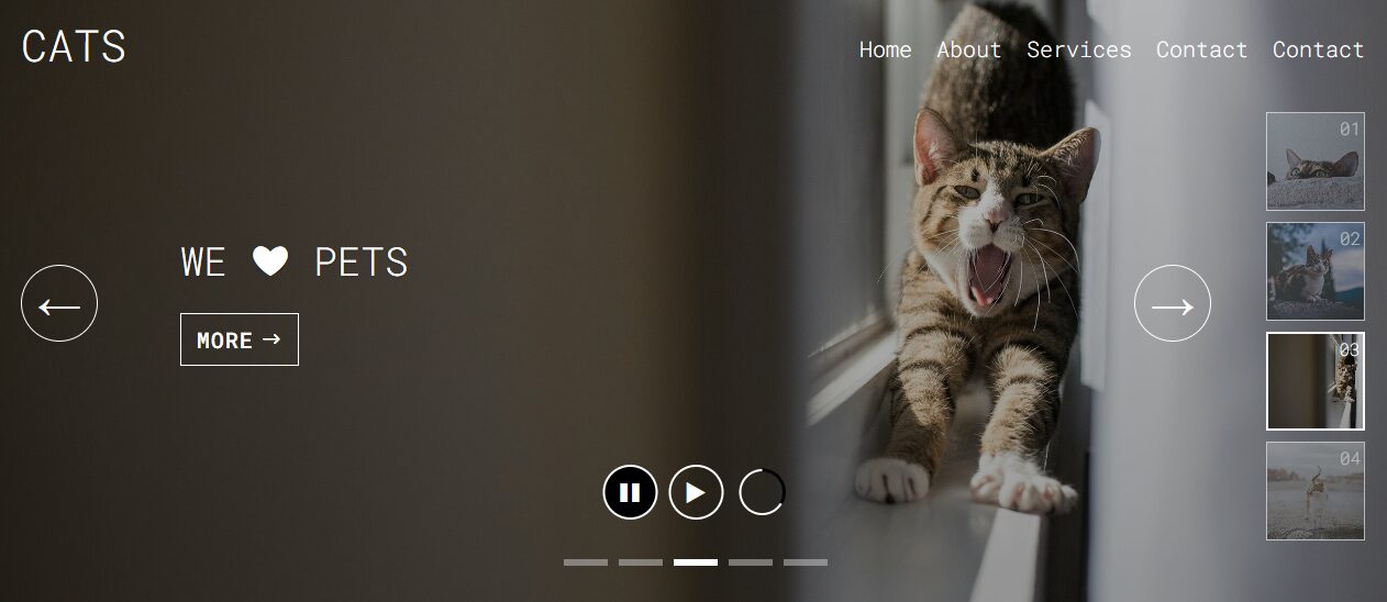
A well-designed slider enhances your website, offering a visually engaging and interactive way to display content. This Divi slider features play, pause, and loader functionality, pagination thumbnails, custom navigation arrows, and full responsiveness across devices, combining style with usability.
In this article, I’ll share the JavaScript (JS), CSS code, and JSON for the slider design.
Design: Button for Play, Pause, and Loader
Description
This design has play, pause, and loader functions. When autoplay is active, the play button switches to a pause button, while the loader (in black) overlays perfectly within the same circle for a seamless experience. This compact approach creates a clean, professional look.
Below are the CSS and JS codes, copy and paste of your page settings or your Divi theme options.
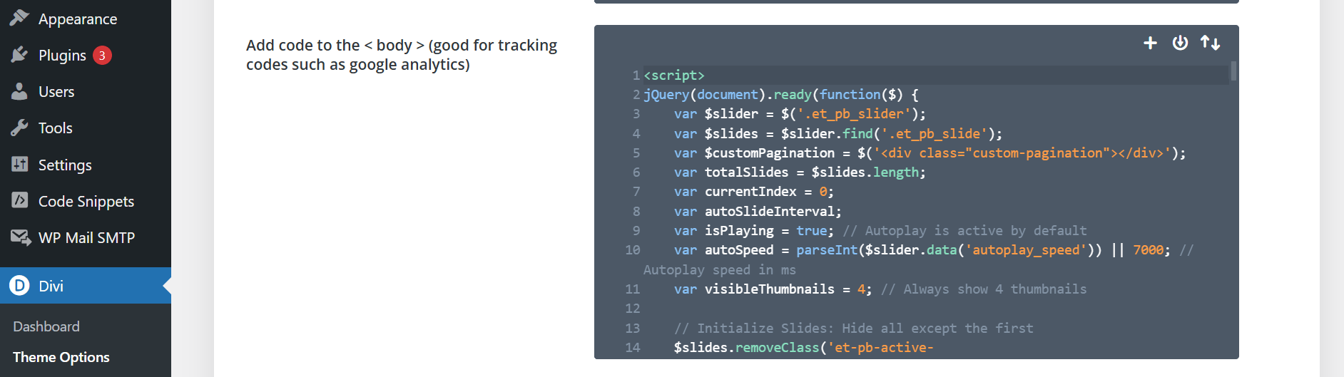
JS CODE :
In your Divi theme options place this on the integration code block section for the Blog (second box)
COPY JS CODE TO CLIPBOARD
<script>
jQuery(document).ready(function($) {
var $slider = $('.et_pb_slider');
var $slides = $slider.find('.et_pb_slide');
var $customPagination = $('<div class="custom-pagination"></div>');
var totalSlides = $slides.length;
var currentIndex = 0;
var autoSlideInterval;
var isPlaying = true; // Autoplay is active by default
var autoSpeed = parseInt($slider.data('autoplay_speed')) || 7000; // Autoplay speed
var visibleThumbnails = 4; // Always show 4 thumbnails
// **1. Initialize Slides: Hide all except the first**
$slides.removeClass('et-pb-active-slide').hide().eq(currentIndex).show().addClass('et-pb-active-slide');
// Build custom photo pagination
$slides.each(function(index) {
var bgImage = $(this).css('background-image');
var slideNumber = ('0' + (index + 1)).slice(-2);
var $thumb = $('<div class="pagination-thumb inactive" data-index="' + index + '"></div>')
.css('background-image', bgImage)
.append($('<div class="number-overlay">' + slideNumber + '</div>'));
$customPagination.append($thumb);
});
// Append custom pagination to the slider
$slider.append($customPagination);
function updatePaginationActiveState(index) {
// Update thumbnail pagination
$customPagination.find('.pagination-thumb').removeClass('active').addClass('inactive');
// Calculate the range of thumbnails to display
var start = Math.max(0, index - (visibleThumbnails - 1));
var end = Math.min(totalSlides, start + visibleThumbnails);
// Show only the current range of thumbnails
$customPagination.find('.pagination-thumb').hide().slice(start, end).show();
$customPagination.find('.pagination-thumb[data-index="' + index + '"]').addClass('active').removeClass('inactive');
// Update line pagination
$slider.find('.et-pb-controllers a').removeClass('active').eq(index).addClass('active');
}
function goToSlide(index) {
// **2. Prevent Animation Queues by stopping ongoing animations**
$slides.stop(true, true);
currentIndex = (index % totalSlides + totalSlides) % totalSlides;
// Remove active class from all slides
$slides.removeClass('et-pb-active-slide').hide().css('opacity', 0);
// Add active class to the target slide
var $activeSlide = $slides.eq(currentIndex);
$activeSlide.addClass('et-pb-active-slide').show().css('opacity', 1);
updatePaginationActiveState(currentIndex);
// **Reset and start the loader if autoplay is active**
if (isPlaying) {
resetLoader();
startLoader();
}
}
function disableAutoplayOnInteraction() {
if (isPlaying) {
stopAutoplay(); // Turn off autoplay when user interacts
}
}
// **3. Handle Click on Pagination Thumbnails**
$customPagination.on('click', '.pagination-thumb', function() {
goToSlide($(this).data('index'));
disableAutoplayOnInteraction();
});
// **4. Handle Click on Navigation Arrows**
var $navPrev = $('<div class="custom-nav-arrow prev-arrow">←</div>').click(function() {
goToSlide(currentIndex - 1);
disableAutoplayOnInteraction();
});
var $navNext = $('<div class="custom-nav-arrow next-arrow">→</div>').click(function() {
goToSlide(currentIndex + 1);
disableAutoplayOnInteraction();
});
var $customNav = $('<div class="custom-navigation"></div>').append($navPrev, $navNext);
$slider.append($customNav);
$slider.find('.et-pb-arrow-next, .et-pb-arrow-prev').remove();
// **5. Create Pause and Play buttons with icons**
var $pauseButton = $('<div class="slider-control pause-button active"><span class="control-icon">❚❚</span></div>');
var $playButton = $('<div class="slider-control play-button"><span class="control-icon">▶</span></div>');
var $controlsContainer = $('<div class="slider-controls"></div>').append($pauseButton, $playButton);
$slider.append($controlsContainer);
// **6. Create Autoplay Progress Loader**
var $loader = $(`
<div class="autoplay-progress" aria-label="Autoplay progress loader">
<svg class="progress-ring" width="50" height="50" aria-hidden="true">
<!-- Background Circle -->
<circle class="progress-ring__background" stroke="#fff" stroke-width="4" fill="transparent" r="20" cx="25" cy="25" />
<!-- Progress Circle -->
<circle class="progress-ring__progress" stroke="#000" stroke-width="4" fill="transparent" r="20" cx="25" cy="25" />
</svg>
</div>
`);
// **7. Append Loader Inside .slider-controls**
$controlsContainer.append($loader);
// **Modified Line**
// **8. Loader Control Functions**
function startLoader() {
var $progress = $controlsContainer.find('.progress-ring__progress'); // Scoped within controls
// Reset dashoffset to full circumference
$progress.css({
'stroke-dashoffset': '125.66', // 2 * PI * r (r=20)
'transition-duration': '0ms'
});
// Trigger reflow to apply the reset immediately
void $progress[0].offsetWidth;
// Animate dashoffset to 0 over autoSpeed duration
$progress.css({
'transition-duration': autoSpeed + 'ms',
'stroke-dashoffset': '0'
});
// Show the loader
$controlsContainer.find('.autoplay-progress').fadeIn(300);
}
function resetLoader() {
var $progress = $controlsContainer.find('.progress-ring__progress'); // Scoped within controls
// Immediately set dashoffset back to full circumference without transition
$progress.css({
'transition-duration': '0ms',
'stroke-dashoffset': '125.66' // Reset to full circumference
});
// Hide the loader
$controlsContainer.find('.autoplay-progress').fadeOut(300);
}
function startAutoplay() {
clearInterval(autoSlideInterval);
autoSlideInterval = setInterval(function() {
goToSlide(currentIndex + 1);
}, autoSpeed);
isPlaying = true;
updateButtonStates();
// **Start the loader**
startLoader();
}
function stopAutoplay() {
clearInterval(autoSlideInterval);
isPlaying = false;
updateButtonStates();
// **Reset the loader**
resetLoader();
}
function updateButtonStates() {
if (isPlaying) {
$pauseButton.addClass('active');
$playButton.removeClass('active');
// Ensure loader is visible
$controlsContainer.find('.autoplay-progress').fadeIn(300);
} else {
$pauseButton.removeClass('active');
$playButton.addClass('active');
// Hide the loader
$controlsContainer.find('.autoplay-progress').fadeOut(300);
}
}
// **9. Event handlers for Pause and Play buttons**
$pauseButton.click(function() {
stopAutoplay();
$pauseButton.addClass('clicked');
setTimeout(function() {
$pauseButton.removeClass('clicked');
}, 300);
});
$playButton.click(function() {
startAutoplay();
$playButton.addClass('clicked');
setTimeout(function() {
$playButton.removeClass('clicked');
}, 300);
});
// **10. Initialize autoplay**
startAutoplay();
// **11. Ensure thumbnails are initially in sync**
updatePaginationActiveState(currentIndex);
// **12. Synchronize autoplay with manual navigation (Line Pagination)**
$slider.on('click', '.et-pb-controllers a', function() {
var index = $(this).index();
goToSlide(index);
disableAutoplayOnInteraction();
});
});
</script>
CSS CODE FOR ONE BUTTON:
In your Divi theme options place this on the Divi options for the CSS

COPY CSS CODE TO CLIPBOARD
/* ============================ Slider Styles ============================ */
/* Controls the main slider's size and appearance */
.et_pb_slider,
.et_pb_slider .et_pb_slide {
  width: 100vw !important; /* Full viewport width */
  max-width: 100% !important;
}

.et_pb_slider {
  margin: 0 auto; /* Centers the slider */
  position: relative;
  overflow: hidden;
}

.et_pb_slider .et_pb_slides,
.et_pb_slider .et_pb_slide {
  overflow: visible !important;
}

.et-pb-controllers {
  margin-top: 60px; /* Space above pagination dots */
}

.et-pb-controllers a {
  width: 40px; /* Size of pagination dots */
  height: 6px;
  margin: 0 5px;
  border-radius: 0; /* Square shape */
}

.et-pb-controllers a.active {
  background-color: white; /* Active dot color */
  opacity: 1;
}

.et-pb-controllers a:not(.active) {
  background-color: #cccccc; /* Inactive dot color */
  opacity: 0.5;
}

/* ============================ Custom Pagination ============================ */
.custom-pagination {
  position: absolute;
  right: 20px;
  top: 56%;
  transform: translateY(-53%);
  z-index: 10;
  overflow: hidden;
  display: flex;
  flex-direction: column;
  align-items: center; /* Center thumbnails */
}

/* Thumbnail styling */
.pagination-thumb {
  width: 90px; /* Thumbnail size */
  height: 90px;
  background-size: cover;
  background-position: center;
  margin: 5px 0; /* Uniform spacing */
  position: relative;
  cursor: pointer;
  border: 1px solid white; /* Neutral border */
  box-sizing: border-box;
  opacity: 0.6; /* Inactive state transparency */
  transition: all 0.3s ease;
}

.pagination-thumb.active {
  border: 2px solid #fff; /* White border for active state */
  opacity: 1; /* Fully visible */
}

.pagination-thumb:hover {
  opacity: 0.8; /* Less transparent on hover */
  transform: scale(1.05); /* Subtle zoom on hover */
}

/* ============================ Number Overlay ============================ */
/* Displays numbers over thumbnails */
.number-overlay {
  position: absolute;
  bottom: -24px; /* Position below thumbnails */
  top: 2px;
  left: 86%;
  transform: translateX(-50%);
  font-size: 16px;
  font-family: 'Roboto Mono', monospace;
  font-weight: 200; /* Thin but readable */
  color: white;
  text-align: center; /* Ensures numbers are centered */
}

/* ============================ Custom Navigation Arrows ============================ */
/* Styles for the left and right navigation arrows */
.custom-navigation {
  position: absolute;
  top: 50%; /* Vertically centered */
  width: 100%;
  z-index: 10;
  display: flex;
  justify-content: space-between;
  transform: translateY(-50%);
}

.custom-nav-arrow {
  background: transparent;
  border: 1px solid white;
  border-radius: 50%; /* Circular buttons */
  color: white;
  font-size: 40px; /* Arrow icon size */
  width: 70px;
  height: 70px;
  line-height: 66px; /* Centers icon vertically */
  text-align: center; /* Centers icon horizontally */
  cursor: pointer;
  user-select: none;
  margin: 0 20px;
}

.custom-nav-arrow.next-arrow {
  margin-right: 160px; /* Positions next arrow */
}

.custom-nav-arrow:hover {
  background: rgba(255, 255, 255, 0.1);
}

.et-pb-arrow-next,
.et-pb-arrow-prev {
  display: none; /* Hides default arrows */
}

/* ============================ Slider Controls ============================ */
/* Styles play/pause buttons and similar controls */
.slider-controls {
  position: absolute;
  bottom: 80px; /* Position from bottom */
  left: 50%;
  transform: translateX(-50%);
  z-index: 10;
  display: flex;
  align-items: center;
}

.slider-control {
  width: 50px; /* Control button size */
  height: 50px;
  border: 2px solid white;
  border-radius: 50%; /* Circular buttons */
  background: transparent;
  display: flex;
  align-items: center;
  justify-content: center;
  margin: 0 5px;
  cursor: pointer;
  position: relative;
  overflow: hidden;
  transition: background 0.3s ease;
}

.slider-control .control-icon {
  font-size: 24px; /* Icon size */
  color: white;
  line-height: 1;
  transition: transform 0.3s ease;
}

.slider-control:hover {
  background: rgba(255, 255, 255, 0.1);
}

.slider-control.clicked .control-icon {
  animation: buttonClickAnimation 0.3s ease-in-out;
}

.slider-control.active {
  background-color: black;
  border-color: white;
}

.slider-control.active .control-icon {
  color: white;
}

/* ============================ Autoplay Progress Loader Styling ============================ */
/* Styles the circular autoplay progress indicator */
.autoplay-progress {
  width: 50px; /* Progress circle size */
  height: 50px;
  margin-left: 5px;
  display: none; /* Hidden by default */
  flex-shrink: 0;
  position: relative;
}

.autoplay-progress .progress-ring {
  transform: rotate(-90deg); /* Starts from top */
  width: 100%;
  height: 100%;
}

.autoplay-progress .progress-ring__background,
.autoplay-progress .progress-ring__progress {
  fill: transparent;
}

.autoplay-progress .progress-ring__background {
  stroke: #fff; /* Circle background color */
  stroke-width: 2; /* Size of loader */
}

.autoplay-progress .progress-ring__progress {
  stroke: #000; /* Progress indicator color */
  stroke-width: 3; /* Size of loader background */
  stroke-dasharray: 125.66; /* Circle circumference */
  stroke-dashoffset: 125.66; /* Starting point */
  transition: stroke-dashoffset linear;
}

/* ============================ Button Click Animation ============================ */
/* Animation effect when buttons are clicked */
@keyframes buttonClickAnimation {
  0% {
    transform: scale(1);
  }
  50% {
    transform: scale(1.3);
  }
  100% {
    transform: scale(1);
  }
}

/* ============================ Responsive Adjustments ============================ */
@media (max-width: 1024px) {
  /* Tablet adjustments */
  .custom-pagination {
    display: none; /* Hide thumbnails */
  }

  .custom-nav-arrow {
    border: none;
    box-shadow: none;
    background: transparent;
  }

  .custom-nav-arrow:hover {
    background: transparent;
  }

  .custom-nav-arrow.prev-arrow {
    margin-left: 5px;
  }

  .custom-nav-arrow.next-arrow {
    margin-right: 2px;
  }
}

@media (max-width: 768px) {
  /* Mobile adjustments */
  .autoplay-progress {
    margin-left: 15px;
  }

  .autoplay-progress .progress-ring__background,
  .autoplay-progress .progress-ring__progress {
    stroke-width: 2;
  }

  .slider-controls {
    justify-content: center; /* Center controls */
  }

  .slider-control {
    margin: 0 10px; /* More spacing */
  }

  /* Removes focus outlines for touch devices */
  .slider-control,
  .pagination-thumb,
  .custom-nav-arrow,
  .et-pb-controllers a,
  .et_pb_more_button {
    -webkit-tap-highlight-color: transparent;
    outline: none;
  }

  .slider-control:focus,
  .pagination-thumb:focus,
  .custom-nav-arrow:focus,
  .et-pb-controllers a:focus,
  .et_pb_more_button:focus {
    outline: none;
  }

  .slider-control:focus-visible,
  .pagination-thumb:focus-visible,
  .custom-nav-arrow:focus-visible,
  .et-pb-controllers a:focus-visible,
  .et_pb_more_button:focus-visible {
    outline: 2px solid rgba(255, 255, 255, 0.5);
    outline-offset: 2px;
  }
}
Final Thoughts
This slider design showcase the versatility of JavaScript and CSS in creating a modern, user-friendly slider. The design is sleek, ideal for minimalistic interfaces and provides clarity and intuitive control.This responsive slider will look great across all devices, making your website more interactive and engaging.
Experiment with these designs to find what works best for your project.