How to Style Your Divi Theme Buttons with Hover Animations
Download Divi Button Animations JSON
Divi button hover animations are an easy win for engagement. With a few CSS classes, your calls-to-action feel lively, modern, and deliberate. Moreover, you keep full control in the Button Module editor.
In this tutorial, you’ll apply ready-made effects to any Divi button. First, import (or copy) the CSS. Then, assign a class name like wave-button, pulse, or expand-diagonal to the button. Finally, preview the result and refine colors, timing, and sizing to match your brand.
Part 1: Style One Button First
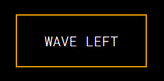
To start, use the Wave Button as your base. This effect slides a color “wave” across the button on hover. As a result, your primary CTA stands out without distracting from the layout. Additionally, you can change the wave color and speed for a perfect fit.
Part 2: Add the CSS in Divi
Next, open Page Settings → Advanced → Custom CSS. Paste the CSS for the effect you want. After saving, test the button on the front end. If needed, adjust timing (for example, 0.6s) for a snappier feel. Likewise, verify contrast so text remains readable.
Part 3: Assign a Class to the Button
Then open your Button Module → Advanced → CSS Class. Enter the class that matches the effect (e.g., wave-button, pulse, or expand-vertical). Save and exit. Subsequently, hover the button to confirm the animation triggers cleanly.
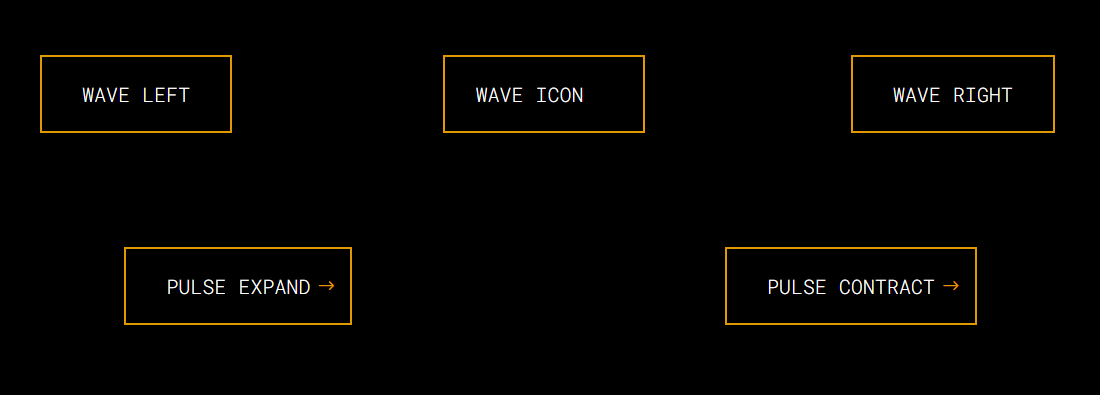
Additional Effects You Can Use
Beyond the basic wave, try these Divi button hover animations to diversify your CTAs:
-
Wave with Icon (
wave-button1) — A subtle slide that pairs well with iconography. -
Wave Right-to-Left (
wave-button-rtl) — Motion originates from the right for visual variety. -
Pulse (
pulse,pulse-contract) — Gentle scale up or down to signal interactivity. -
Diagonal Expand (
expand-diagonal,expand-diagonal-top-left) — Color grows across the button at an angle. -
Vertical Expand (
expand-vertical) — A smooth sweep from top to bottom. -
Box Shadow Variants (
box-shadow,box-shadow-left-bottom) — Offset glow that reinforces depth. -
Neon Glow (
neon-glow) — A bold highlight for high-impact CTAs. -
Horizontal Expand (
expand-horizontal) — Fills from center to edges for a crisp reveal.
Importantly, these effects are CSS-only. Therefore, they’re lightweight, responsive, and compatible with standard Divi layouts.
Pro Tips for Best Results
-
Disable button icons. Otherwise, some animations may not display as intended.
-
Keep labels short. Consequently, the effect remains smooth on smaller screens.
-
Test contrast. In addition, ensure sufficient color contrast for accessibility.
-
Mix strategically. For example, reserve bolder effects for primary CTAs and use subtler ones for secondary actions.
Why These Animations Help
Well-timed motion guides attention. Consequently, visitors notice key actions like Buy Now, Sign Up, or Learn More. Furthermore, tasteful micro-interactions elevate brand polish without adding heavy scripts or plugins. In short, Divi button hover animations improve clarity, focus, and conversions.
Part 1: Styling the Button
We’ll use the Wave Button Animation as an example for this tutorial. This animation makes a vibrant wave of color slide over the button when hovered.
Part 2: Adding the CSS to Your Divi Theme
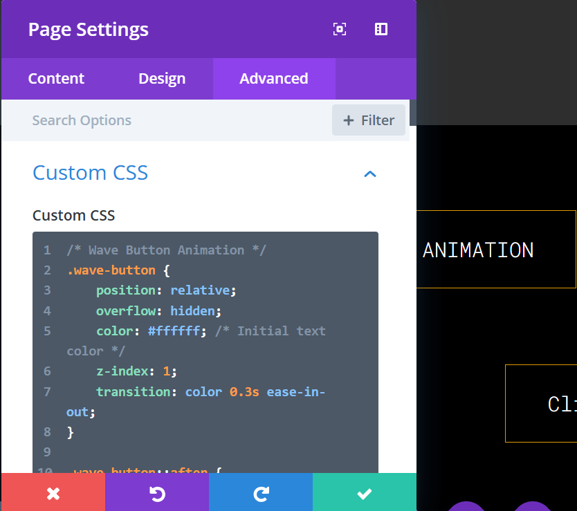
- Navigate to your page settings.
- Go to Page settings > Advance > Custom CSS.
- Paste the above CSS code into the Custom CSS box and save your changes.
Copy CSS to clipboard
wave-button
wave-button
/* Wave Button Animation */
.wave-button {
position: relative;
overflow: hidden;
color: #ffffff; /* Initial text color */
z-index: 1;
transition: color 0.3s ease-in-out;
}

.wave-button::after {
content: "";
position: absolute;
top: 0;
left: -100%; /* Start off-screen to the left */
width: 100%;
height: 100%;
background-color: #e09900; /* Wave color */
transition: left 0.6s ease-in-out; /* Slower transition for the wave effect */
z-index: -1;
}

.wave-button:hover::after {
left: 0; /* Slide in from left to fill the button */
}

.wave-button:hover {
color: #ffffff; /* Ensure text color remains white on hover */
}
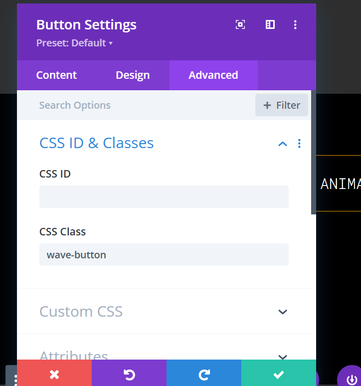
Part 3: Assign the CSS Class to Your Button
- Open the button Settings on the page.
- Edit the button and navigate to the Advanced > CSS Class field.
- Add the class
wave-buttonto the CSS Class field and save your changes.
wave-button
OTHER ANIMATIONS CSS AND CLASS
Wave Button with icon
wave-button1
/* Wave Button1 */
.wave-button1 {
position: relative;
overflow: hidden; /* Ensure animation stays within the button */
background-color: transparent; /* Transparent by default */
display: inline-flex; /* Align text and icon */
align-items: center; /* Center content vertically */
justify-content: center; /* Center content horizontally */
color: #ffffff; /* Button text color */
z-index: 1;
transition: background-color 0.3s ease, color 0.3s ease; /* Smooth transition for text and background */
}

/* Wave Animation */
.wave-button1::after {
content: "";
position: absolute;
top: 0;
bottom: 0;
right: -40px; /* Start animation off-screen */
width: 40px; /* Animate only part of the button */
background-color: #e09900; /* Wave color */
transition: all 0.6s ease-in-out; /* Smooth slide-in effect */
z-index: -1; /* Keep animation behind button content */
opacity: 0; /* Transparent until hover */
}

/* Hover Animation */
.wave-button1:hover {
background-color: #e09900; /* Set background color on hover */
color: #ffffff; /* Keep text white on hover */
}

.wave-button1:hover::after {
right: 0; /* Slide in animation on hover */
opacity: 1; /* Make wave visible */
}

/* Ensure Content Visibility */
.wave-button1 {
position: relative;
z-index: 1; /* Keep button content above animation */
}
_____________________________________
Wave Button Animation (Right to Left)
wave-button-rtl
.wave-button-rtl {
    position: relative;
    overflow: hidden;
    color: #ffffff; /* Initial text color */
    z-index: 1;
    transition: color 0.3s ease-in-out;
}

.wave-button-rtl::after {
    content: "";
    position: absolute;
    top: 0;
    left: 100%; /* Start off-screen to the right */
    width: 100%;
    height: 100%;
    background-color: #e09900; /* Wave color */
    transition: left 0.6s ease-in-out; /* Smooth transition for the wave effect */
    z-index: -1;
}

.wave-button-rtl:hover::after {
    left: 0; /* Slide in from right to fill the button */
}

.wave-button-rtl:hover {
    color: #ffffff; /* Ensure text color remains white on hover */
}
_____________________________________
Pulse (Expand)
pulse
/* Hover effect: Only apply scaling on hover */
.et_pb_button.pulse:hover {
transform: scale(1.1); /* Button scales up smoothly on hover */
}

/* Active state: Reset scaling */
.et_pb_button.pulse:active {
transform: scale(1); /* Reset to original size on click */
}
_____________________________________
Pulse (Contract)
pulse-contract
.et_pb_button.pulse-contract {
    position: relative;
    overflow: visible; /* Keep Divi's default styles intact */
    display: inline-block; /* Ensures proper button layout */
    transition: transform 0.4s ease-in-out; /* Smooth contraction effect */
}

.et_pb_button.pulse-contract:hover {
    transform: scale(0.9); /* Shrinks the button slightly on hover */
}

.et_pb_button.pulse-contract:active {
    transform: scale(1); /* Reset to original size on click */
}
_____________________________________
Diagonal (Bottom Top)
expand-diagonal
.expand-diagonal {
    position: relative;
    overflow: hidden;
    color: #ffffff;
    z-index: 1;
    transition: color 0.3s ease-in-out;
}

.expand-diagonal::after {
    content: "";
    position: absolute;
    top: 50%;
    left: 50%; /* Start from the center diagonally */
    width: 20%;
    height: 20%;
    background-color: #e09900;
    transition: width 0.6s ease-in-out, height 0.6s ease-in-out, top 0.6s ease-in-out, left 0.6s ease-in-out;
    z-index: -1;
}

.expand-diagonal:hover::after {
    width: 200%;
    height: 200%; /* Expand diagonally */
    top: 0;
    left: 0;
}

.expand-diagonal:hover {
    color: #ffffff;
}
_____________________________________
Diagonal (Top Bottom)
expand-vertical
.expand-vertical {
    position: relative;
    overflow: hidden;
    color: #ffffff;
    z-index: 1;
    transition: color 0.3s ease-in-out;
}

.expand-vertical::after {
    content: "";
    position: absolute;
    top: -100%; /* Start off-screen at the top */
    left: 0;
    width: 100%;
    height: 100%;
    background-color: #e09900;
    transition: top 0.6s ease-in-out;
    z-index: -1;
}

.expand-vertical:hover::after {
    top: 0; /* Slide in from top to bottom */
}

.expand-vertical:hover {
    color: #ffffff;
}
_____________________________________
Box Shadow (right)
box-shadow
.box-shadow {
position: relative;
overflow: hidden;
color: #ffffff;
background: #1a1a1a; /* Neutral base background */
border: 2px solid transparent;
box-shadow: 10px 10px 0px 0px rgba(224, 153, 0, 0); /* Initial state with no visible shadow */
transition: box-shadow 0.6s ease-in-out, color 0.3s ease-in-out;
}

.box-shadow:hover {
box-shadow: 10px 10px 0px 0px rgba(224, 153, 0, 0.8); /* Visible shadow on hover */
background: #e09900; /* Matches glow to the hover background */
color: #ffffff; /* Keeps text white */
}
_____________________________________
Box Shadow (left)
box-shadow-left-bottom
.box-shadow-left-bottom {
    position: relative;
    overflow: hidden;
    color: #ffffff;
    background: #1a1a1a; /* Neutral base background */
    border: 2px solid transparent;
    box-shadow: 10px 10px 0px 0px rgba(224, 153, 0, 0); /* Initial state with no visible shadow */
    transition: box-shadow 0.6s ease-in-out, color 0.3s ease-in-out;
}

.box-shadow-left-bottom:hover {
    box-shadow: -10px 10px 0px 0px rgba(224, 153, 0, 0.8); /* Shadow shifts to left-bottom */
    background: #e09900; /* Matches glow to the hover background */
    color: #ffffff; /* Keeps text white */
}
_____________________________________
Diagonal Expand from Top-Left
expand-diagonal-top-left
.expand-diagonal-top-left {
    position: relative;
    overflow: hidden;
    color: #ffffff; /* Initial text color */
    z-index: 1;
    transition: color 0.6s ease-in-out;
}

.expand-diagonal-top-left::after {
    content: "";
    position: absolute;
    top: 0; /* Start at the top */
    left: 0; /* Start at the left */
    width: 20%; /* Initial size of the diagonal element */
    height: 20%;
    background-color: #e09900; /* Diagonal color */
    transition: width 1.7s ease-in-out, height 1.7s ease-in-out, top 1.7s ease-in-out, left 1.7s ease-in-out;
    z-index: -1;
}

.expand-diagonal-top-left:hover::after {
    width: 200%;
    height: 200%; /* Expand diagonally */
    top: -50%; /* Expands upwards to cover the top area */
    left: -50%; /* Expands leftwards to cover the left area */
}

.expand-diagonal-top-left:hover {
    color: #ffffff; /* Ensure text color remains white on hover */
}
_____________________________________
Neon Glow
neon-glow
.neon-glow {
    position: relative;
    overflow: hidden;
    color: #ffffff;
    background: #1a1a1a; /* Neutral base background */
    border: 2px solid transparent;
    box-shadow: 0 0 0 rgba(224, 153, 0, 0);
    transition: box-shadow 0.6s ease-in-out, color 0.3s ease-in-out;
}

.neon-glow:hover {
    box-shadow: 0 0 15px rgba(224, 153, 0, 0.8), 0 0 30px rgba(224, 153, 0, 0.6);
    background: #e09900; /* Matches glow to the hover background */
    color: #ffffff; /* Keeps text white */
}
_____________________________________
Horizontal Expand from Center
expand-horizontal
.expand-horizontal {
    position: relative;
    overflow: hidden;
    color: #ffffff;
    z-index: 1;
    transition: color 0.3s ease-in-out;
}

.expand-horizontal::after {
    content: "";
    position: absolute;
    top: 0;
    left: 50%; /* Start from center horizontally */
    width: 0;
    height: 100%;
    background-color: #e09900;
    transition: width 0.6s ease-in-out, left 0.6s ease-in-out;
    z-index: -1;
}

.expand-horizontal:hover::after {
    width: 100%;
    left: 0; /* Expand to full width */
}

.expand-horizontal:hover {
    color: #ffffff;
}
_____________________________________
Important Note
The hover animations will work best if button icons are turned off in the Divi Button Module. If button icons are enabled, the hover animation may not display as intended.
<!– wp:social-links –><ul class=”wp-block-social-links”><!– wp:social-link {“url”:”https://gravatar.com/timgum”,”service”:”gravatar”,”rel”:”me”} /–></ul><!– /wp:social-links –>